
The coffee table is the hardest-working surface in your living room. It holds the cups of tea, the remote controls, the feet at the end of a long day — and it sits in the exact centre of everyone’s sightline, all evening, every evening. No other surface in your home is looked at quite so much, which means no other surface rewards a little styling attention quite so richly.
Here is the good news: making a coffee table look expensive has almost nothing to do with spending money. Designers use the same handful of tricks on every table, from a flea-market find to a bespoke piece costing thousands. The tricks are about composition — height, grouping, texture, restraint — and they work identically whether your objects cost £2 or £200.
This guide gives you eight of those tricks, tuned for autumn. By the end, your coffee table will look like it was styled by a professional — warm, layered, and quietly luxurious — using mostly things you already own plus a few well-chosen seasonal touches.
Trick 1: Start With a Tray — The Foundation of Everything
Every designer coffee table starts with a tray, and there is a reason: the tray is what turns a collection of objects into a composition. It creates a border, corrals the clutter, and tells the eye “this is intentional.” Without a tray, objects drift; with one, they belong.
For autumn, a tray in a warm material does double duty as seasonal decor: aged brass, dark wood, woven rattan, or even a lacquered tray in deep green or oxblood. Size it to cover roughly a third to half of your table’s surface — big enough to hold a real grouping, small enough to leave usable space for cups.
Everything decorative on your coffee table should live on the tray, or be deliberately placed off it. The remote controls, coasters, and daily clutter get corralled onto the tray too — that is the tray’s secret practical job. A beautiful tray holding the remotes looks styled; remotes loose on the table look like mess, even on the most expensive table in the world.
Trick 2: The Book Stack — Instant Intellectual Luxury
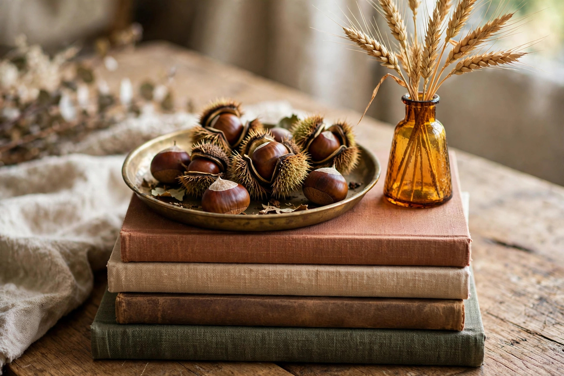
Nothing says “expensive” on a coffee table faster than a stack of beautiful books. This is the oldest trick in interior styling, and it works because books add height, colour, texture, and personality in one move — and they are genuinely useful as a platform for smaller objects.
Build your stack with two to four books, largest at the bottom. Coffee-table books on art, photography, travel, or interiors are the classics, but any hardback with an attractive spine and cover works. Charity shops are full of them for a pound or two — look for covers in your autumn palette of rust, ochre, deep green, and cream.
The top of the stack is prime real estate: a small brass dish, a candle, a tiny pumpkin, or a bud vase with a dried stem. The book stack lifts these small objects into the sightline and gives them importance they would not have sitting flat on the table.
One rule: only display books you would not be embarrassed for a guest to open. The stack is an invitation to browse — choose books that reflect your actual interests, and the table will feel personal rather than staged.
Trick 3: Vary the Heights — The Skyline Rule
Look at any professionally styled coffee table and you will see a skyline: tall, medium, and low objects arranged so the eye travels up and down. A table where everything is the same height looks flat and dull, no matter how pretty the individual pieces are.
Aim for three height levels on your tray. Tall: a candlestick, a bud vase with stems, a small branch in a bottle. Medium: your book stack, a lidded box, a medium pumpkin. Low: a brass dish, a candle votive, a scattered few conkers or acorns.
The classic arrangement is a triangle: the tallest object at the back, medium height to one side, low objects filling the front. This works on round tables, rectangular tables, and ottomans alike — it is about the relationship between the objects, not the shape of the table.
If your table looks flat, the fix is almost always “add something tall.” A single stem in a bud vase can rescue an entire arrangement in ten seconds.
Trick 4: Odd Numbers and the Rule of Three
Designers group objects in odd numbers — threes and fives — because odd groupings look natural and collected while even groupings look formal and deliberate. A pair of candlesticks says “dining room”; three candlesticks of different heights say “I found these over the years and I love them.”
Apply the rule at two scales. On the tray as a whole, aim for three main groupings: the book stack, the candle cluster, the natural element. Within each grouping, use odd numbers: three votives, five conkers in the dish, a single stem rather than a pair.
This is also why a single pumpkin looks chic and two pumpkins can look like a supermarket display. Three pumpkins of graduated size, on the other hand, look like a still life. Odd numbers are doing quiet compositional work that the eye registers as “expensive” without knowing why.
Trick 5: Texture Is the Real Luxury
Expensive-looking rooms are rarely about expensive things — they are about interesting textures. The eye reads a mix of textures as richness, and texture is free: it comes from combining materials that contrast with each other.
On your autumn coffee table, aim for at least four textures. Smooth: brass, glass, lacquer. Rough: wood, rattan, stone. Soft: a folded throw draped over the table’s edge, a velvet pumpkin. Natural: dried wheat, pinecones, a branch. The contrast between a cool brass candlestick and a rough pinecone is what makes both of them look better.
Autumn is texture’s best season, so lean in. A chunky knit throw over the arm of the sofa next to the table, a woven basket underneath holding magazines, a sheepskin draped over the table’s lower shelf — every soft layer makes the hard objects on top look more precious.
Avoid the matchy-matchy trap: a table where everything is smooth ceramic looks flat, however beautiful each piece is alone. Break up any single texture with its opposite and watch the whole arrangement come alive.
Trick 6: Candlelight — The Cheapest Luxury There Is

If you do nothing else on this list, do this: put candles on your coffee table and light them every evening. Candlelight is the single most transformative styling tool in existence. It flatters every object, every person, and every room — and a pack of tealights costs almost nothing.
For autumn, cluster your candles rather than dotting them singly around the room. Three amber glass votives grouped on the tray, or a pair of brass candlesticks with ivory tapers beside the book stack. Grouped flames read as abundant; scattered single candles read as an afterthought.
Vary the candle heights within the cluster for the skyline effect, and mix real flame with LED where it makes sense — real candles where you can see and tend them, LED inside anything you might forget. The warm flicker reflecting in amber glass or brass at dusk is the definition of autumn cosiness.
Keep a candle snuffer or a small lid nearby rather than blowing candles out — it is cleaner, safer, and feels appropriately ritualistic. Little rituals are part of what makes a styled table feel like a lifestyle rather than a display.
Trick 7: The Seasonal Edit — Autumn Touches, Not an Autumn Explosion
The difference between a chic autumn coffee table and a craft-fair explosion is restraint. Choose two or three seasonal elements and let them breathe, rather than covering every centimetre with pumpkins.
Good seasonal touches for the coffee table: a small cluster of miniature pumpkins or gourds in one corner of the tray, a bud vase with dried wheat or preserved eucalyptus, a brass dish of conkers or acorns, a candle in an autumn scent. Pick two or three of these — not all of them.
Fresh elements beat plastic every time. A real mini pumpkin that you replace in November, real dried stems, real conkers gathered on a walk — these have a texture and imperfection that no manufactured autumn decor can match, and they cost nothing.
Remember the tray boundary: seasonal objects stay on the tray, where they look curated. The moment autumn decor starts colonising the whole table surface, the expensive look evaporates. Restraint is the luxury.
Trick 8: Leave Breathing Room — The Space Is the Style
The final trick is the one most people resist: leave empty space. A coffee table that is completely covered looks cluttered no matter how beautiful the objects are. The empty space is what lets the eye rest and what makes each styled grouping look deliberate.
A good rule of thumb: style about two-thirds of your table’s surface and leave one-third clear for actual living — cups of tea, a book you are reading, your feet. A coffee table that cannot hold a mug of tea has failed at its primary job, however gorgeous it looks.
This also means editing ruthlessly. If you have styled the tray beautifully and there is still a pile of magazines, yesterday’s post, and three coasters scattered around it, clear them. Put the magazines in the basket underneath, file the post, stack the coasters on the tray. The styling only reads as expensive when the surroundings are calm.
The most expensive-looking coffee tables are not the ones with the most beautiful objects — they are the ones where every object looks like it was chosen, placed, and given room to breathe.
Walk through the eight tricks this weekend with what you already own: corral everything onto a tray, stack the books, build your skyline, count in threes, mix your textures, light the candles, add two autumn touches, and clear the breathing room. Then sit down on the sofa at dusk, put your feet up, and look at your table in the candlelight. That quiet, layered, golden feeling? That is what expensive looks like — and you did it yourself.
Leave a Reply